Here’s Everyone Who’s Legally Immigrated to the U.S. Since 1820
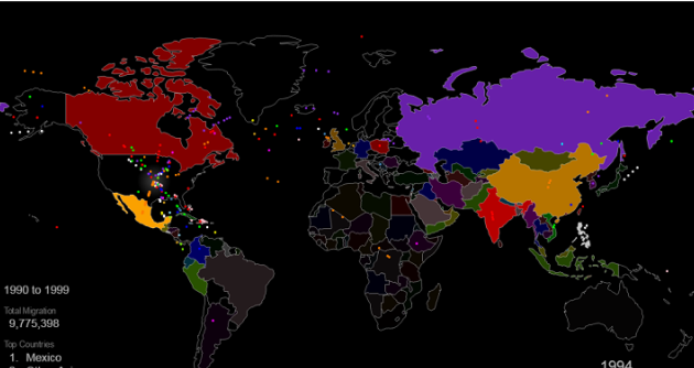
From 1820 to 2013, 79 million people obtained lawful permanent resident status in the United States. The interactive map below visualizes all of them based on their prior country of residence. The brightness of a country corresponds to its total migration to the U.S. at the given time.
Use the controls at the bottom to stop / resume the animation or to move back and forth in time.
Two Centuries of U.S. Immigration (1 dot = 10,000 people)
Full screen interactive map / HD video
Through time, the immigration sources trace a clear path through the world. Starting in Western Europe with Ireland, Germany, and the U.K., the source moves east to Italy, Russia, and Hungary before shifting to the Americas and finally to Asia. The same trend is clear looking at the history of New York City’s foreign born population.
Here are the largest immigration sources charted over time, showing the progression.

While it may seem that immigration over the last few decades has been higher than ever before, the picture looks very different when viewed relative to the size of the U.S. population.
Here is the same chart, with the immigration shown as a percentage of the U.S. population.

If you liked this map, sign up to be notified of new Metrocosm posts
Credit:
- Immigration data: Department of Homeland Security’s Office of Immigration Statistics (download: full report, data in Excel format). The data used for the map is “persons obtaining lawful permanent resident status,” which does not include illegal immigration or, as pointed out by@artsyTrish, people brought to the U.S. as slaves (“forced immigration”).
- World borders: Natural Earth
RELATED PUBLICATION: How to Win the Immigration Debate


Leave a Reply
Want to join the discussion?Feel free to contribute!